Zenin Adrian

Wednesday, January 9, 2008

Debating modern Indonesian architecture

Was published in Jakarta Post on Sunday December 23, 2007

Indonesia is always at the crossroads between cultures and ideas. On one hand, we have our own diverse cultures. On the other hand, there are modern ideas which always try to negotiate the boundaries.

Architecture is not only a product of cultures, but it is also a product of thoughts and ideas. Therefore, Indonesian architecture is constantly a crossroads between traditional locality and modernity. This tension between the two elements sparked an endless debate which characterized the Indonesian modern architecture.

One important issue that the Tension-Span exhibition at Erasmus Huis, Jakarta, deals with is the process towards the modern Indonesian architecture. This is closely related to the establishment of a modern Indonesian society.

According to the curator of the exhibition, Amir Sidharta, the National Awakening of 1908 and the Youth Pledge of 1928 serve as the milestones as Indonesia's modern architecture emerged parallel with these two events.

The exhibition focused on historical aspects of the debate without elaborately investigating how the exhibited architectural works are canonical and plays important role on the debate. It reminds us how our modern architecture represents the development of our modern society.

The debate itself started as criticism towards Dutch East Indies architecture which was dominated by spiritless reproduction of Neo-Hellenism works, offered by PAJ Moojen in 1907. After that, there was tension between two factions of Dutch architects, one with disregard to local context and the other with greater attention to localities (communities, environment, technologies and cultures).

After the nation's independence, Soekarno, who was trained as an architect, envisioned on a modern architectural discourse which could convey a national Indonesian characteristic. However, his interest toward Modernism was mostly based on visual aesthetics and utopian ideas rather than efficient productivity or those of technical aspects.

The Conefo Complex (now the DPR/MPR building) is the best example for the articulation of his vision. The thin shell structure system symbolized technological advancements at that time, which represented the fundamental idea of modernity in Indonesia.

Later in the 1960s, a group of young architects called ATAP, continued the debate. They rejected the idea that Indonesian architecture can be characterized through applying traditional forms.

The debate continued on to the later generations, as it experienced different challenge from the rise of domestic economy in 1970s and economic liberalization in the second half of 1980s.

Private enterprises demanded profit-oriented architecture as opposed to providing comfortable working or living environment. By the late 1980s, some recent graduates in architecture formed a group called Forum Arsitek Muda Indonesia (Forum for the Young Indonesian Architects).

At that time, the local and global tension was reduced to visual issues, as reflected to their visually compelling works that attracted local and global media attention. Their publicity achievement accelerated their dominance within Indonesia's architecture field and inspired younger generation of architects.

Today, there are more informal groups of young architects who continue on the debate across Indonesia. The current debate also produced young architects with different approaches toward solving various different issues whether technical, economical or even social.

The Tension-Span exhibition seemed too condensed into such a small space while the amount of knowledge exceeded the available exhibition panels. This historically focused exhibition should be perceived as the beginning of more elaborate upcoming series.

There should be more exhibitions on how the design of the exhibited buildings are canonical and contributed to this endless debate of modern Indonesian architecture so people who are unfamiliar with architecture could easily get into the debate and understand what has been going through Indonesian architects' minds for 100 years.

Captions:

Caption 01: Today's visually compelling contemporary Indonesian architecture as represented by Gedung 28, Jakarta

Caption 02: The model of Villa Isola, Bandung represents the Western-oriented faction in the early debate of modern Indonesian architecture

Caption 03: The Canefo complex building (now the DPR/MPR building) articulates the vision of modern Indonesian society.

All images are by Zenin Adrian

Reinventing the garden house

Was published in Jakarta Post on Sunday December 16, 2007

During the property boom and development of satellite cities on the outskirts of Jakarta during the 80s and 90s, there was a huge market demand for garden houses and country-style houses in the real estate industry.

Parallel with aggressive planning of new highways and toll roads, people would go further away from the city center in pursuance of their dream (and affordable) homes. The mindset was: the further you are away from the city, the bigger the lawn you can afford.

However, the economic crisis played a role in taking away those dreams. Road network development could not keep up with the vast property development. Traffic congestion killed the enjoyment of having the garden houses. For people earning their living in the city center, they could waste a third to a quarter of their day stuck in the traffic.

Today, living in close proximity to the city center is much more desirable for a lot of people. They are willing to live on a much smaller urban lot.

Generally, the concept of the garden house simply meant having a huge lawn in the backyard without exploring the relationship between indoor and outdoor space. Conceptually, the house was more introvert and separated from the exterior.

Some architects offered interesting modern approaches in re-inventing the garden house concept for urban application. Adi Purnomo blurred the boundary between the house and landscape in his works in Ciganjur and Jl. Tangkuban Perahu, Jakarta. Both houses elaborately exercise the relationship of interior and exterior spaces.

The Ciganjur house reversed the concept "house in the garden" to "garden in the house" by converting the whole lot into a single house experience. It is a modern interpretation of the compound house concept in Balinese architecture where the rooms are not contained in a single building but distributed throughout the lot.

The house itself employs a simple house form with minimal decoration. Outdoor spaces become the interior of the house, where lush softscape is the main decoration element. Living rooms also serve as terraces to maximize enjoyment of the landscape.

The house at Jl. Tangkuban Perahu took a different direction. While the house maintains the image of a single house, it also integrates the landscape in an unprecedented way. Not only the garden is stacked and interwoven with the house, but also became the fa‡ade.

The vertical gardens create the sense of privacy while allowing the house to breathe. The main stairway has a dual function that performs as seating for any social event.

This intimate relationship between the landscape and the house provides good natural cross ventilation and day lighting. It also increases the water retention ability of the house, so it dramatically reduces excess water out to the surrounding neighborhood.


Essentially, in designing a dwelling, aesthetic consideration is becoming less important. The interrelationship between spaces and its contribution to the environment are more valuable. Although both of these houses are definitely not bug-free, but the experience of tropical living is maximized

Captions:

Caption 01: One of the living rooms also serves as a terrace

Caption 02: From the entrance view, the Ciganjur house consists of different layers of indoor and outdoor spaces

Caption 03: The house on Jl. Tangkuban Perahu has vertical gardens

Caption 04: The stairway has a dual function and also serves as seating for social events or performances

Caption 05: Operable extra-large transparent windows still maintain the connection with the landscape


All images are courtesy of Adi Purnomo

Entering the epicenter

Was published in Jakarta Post on Sunday December 9, 2007

At this moment, Rasuna Epicentrum is probably one of the most ambitious superblock developments in Jakarta, on a parallel with other mixed-use areas like the Sudirman Central Business District and Mega Kuningan. I consider the mixed-use development concept to be the most appropriate for living in the city center.

The concept abandons the ancient zoning separations of commercial and residential, which play a major role in generating vehicle traffic. Some urban planners believe that the mixed-use concept can help reduce our carbon footprint.

In order to succeed, the complex should generate more pedestrian traffic because of the close proximity between living spaces and workplaces, rather than motorized vehicle traffic to avoid congestion. A mass transportation hub should be connected with the pedestrian network of the complex.

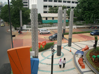
Designed by Urbane, a Bandung-based architectural design office, the entrance gate of the Rasuna Epicentrum complex takes a whole different approach to traditional gate design, emphasizing accessibility and the resurfacing of the landscape.

The resurfacing strategy, which involves applying different paving materials for various purposes, has two important tasks: to slow down motorized traffic and to create a more pleasant sidewalk. Rough paving stones are used to reduce the speed of the motorists. The sidewalk is paved with a similar but finer texture to the road and leveled with the road rather than being raised, so it appears there is only slight difference between the road and the sidewalk. In my opinion, this gesture is a part of the effort of converting the gate area to a square-like place that is more pedestrian friendly.

However, some minor details have to come to my attention. The area is also paved with crisscrossing lines which have no meaning when viewed from the street level. We can only see and understand how those lines are interconnected with one another when we view them from above.

Those lines are set in a highly complex and illogical pattern, and consequently it is obvious that some of the construction workers are still struggling to finish laying it out.

I wish that the pattern was not excessively decorative and that it did not discard its functional values. The pattern could have been used to define pathways for pedestrians and motorists.

In most cities in Japan, pedestrian markings with extruded surface textures are used to increase accessibility by creating paths for the blind. At Rasuna Epicentrum, if a blind person tried to follow the interweaving path, he or she would bump into a light pole or end up in the middle of the street.

I must commend Rasuna Epicentrum's efforts in their approach for improving pedestrian environment in the area. I have been enjoying that short stretch of the road, and hopefully the effort will continue into the whole new complex and become a prototype for similar development in other areas. The entrance gate also represents how improving public amenities can be accomplished through collaboration with the private sector.

Captions:

Image 01 The entrance gate area is viewed from the pedestrian bridge.

Image 02 Disconnected path on the sidewalk.

Image 03 Criscrossing lines are illogical when viewed from the street level.

All images are by Zenin Adrian

An environmentally friendly past

Was published in Jakarta Post on Sunday December 2, 2007

Oil prices have escalated dramatically in the last few months and some people harbor concerns this will lead to the next energy crisis in the very near future.

And building and construction operations account for 40 percent of energy consumption and is responsible for 33 percent of carbon dioxide emissions worldwide.

But this sector will suffer from the impact of the crisis -- in addition to the effects the industry will see from global warming.

Architects and engineers are at the frontline of the building, construction and operation industry and are responsible for making buildings more energy efficient.

In some countries in Europe, Asia, Australia and North America, there have been growing efforts to promote environmentally friendly building practices -- popularly known as green building.

One focus is to reduce energy loads by optimizing heating ventilation and air conditioning (HVAC) systems.

Internationally, there are growing numbers of new building designs that comply with this effort.

New facade designs are today equipped with shading devices in order to reduce interior heat from direct sunlight.

In Jakarta's past, a growing interest in design driven by efforts to minimize energy load or to reduce the need for air conditioning (AC) is evident in some buildings on the main street of Jakarta.

Cheap energy costs and our dependency on AC units have provided shortcuts to achieve interior thermal comfort.

Glass cladding technology has preceded design exploration in solar shading devices.

Images shown here include traces of past efforts made toward energy efficiency.

All of them are interesting patterns, characterized by modern tropical building facade designs.

These familiar patterns have a significant role in cooling the building's outer skin layer and contribute to lowering the energy load for air conditioning needs.

The first image show stainless steel patterns from the Istiqlal Mosque in Jakarta.

Built in the 60s, the design still looks contemporary.

Designed by the late F. Silaban, the mosque shows early efforts in contextualizing modern buildings with a tropical climate.

Silaban also was responsible for the facade design of the Bank Indonesia Building on Jl. MH Thamrin, shown here in image 2.

Both building's facades represent the movement toward environmental concern in Indonesian architecture.

Not too far from the Bank Indonesia building, lies the dusty and old United Nation Building.

They comprise cellular louvers designed with a slanted profile.

These cells enclose the entire building and provide the impression of one single object.

Similarly, the S. Widjojo Center building on Jl. Jend. Sudirman employs deeper shading devices for the facade skin.

The envelope's design created a more distinct and unique look compared to other adjacent buildings.

The functional pattern produced an elegant image and helped save the environment.

These buildings show us past efforts made to create energy efficient building designs and they become more and more relevant with today's environment crisis and escalating energy costs.

It is time for us to rethink and to learn from the past.

Captions:

Image 01 The Istiqlal Mosque, Jakarta.

Image 02 Bank Indonesia Building on Jalan Sudirman.

Image 03 Widjojo Center Building.

All images are by Zenin Adrian

Revisiting local architecture after disasters

Was published in Jakarta Post on Sunday November 25, 2007


It has been a more than year since the earth shook for 58 seconds in Central Java, shattering thousands of lives in the province and Yogyakarta.

Many people were killed or seriously injured by falling brick walls in their own homes, which had been built with traditional techniques and did not have the engineering necessary to withstand an earthquake.

After more than a year of reconstruction, residents are slowly getting back on their feet. Most of the new houses were constructed collectively by local communities, under the supervision of students, foreign consultants, architects and engineers.

A lot of the built houses used a design provided by local government through their free building permit program, while other housing types were a result of new construction techniques.

Eko Prawoto was one of the many architects that were involved in the reconstruction effort. His design was driven merely to save costs and try to salvage as many building materials as possible from the former houses.

Distributed funds from the government were barely enough to build the core houses, so Eko designed the basic structure and roofing system, derived from traditional pitch roof form, while the rest of the houses were enclosed by salvaged materials. Consequently, each of his houses is personalized and has its own distinct characteristics generated by variations in door and window components.

The reconstruction effort can also be seen as an opportunity to introduce a new construction system that is more robust and resistant to earthquakes. Holcim Indonesia, through its Solusi Rumah program, introduced their new interlocking concrete brick system, which radically reduces wood usage for concrete formworks and speeds up the construction process. The system was widely used to build public facilities such as schools, community centers, public bathrooms and even small housing projects.

While the system simplifies the construction technique, Holcim Indonesia provided an extensive training program for construction workers in order to be assured of its correct application. The modular concrete brick system requires the building to be designed in specific 15 x 15 centimeter modules to maintain its effectiveness and is easily adapted to local house design.

However, not all the houses built within the relief effort were designed to blend with vernacular architectural values. The new housing complex built by the Domes for the World group went in a completely different direction. The houses are constructed in a dome form, similar to the igloos of the Inuit, and are equipped with conventional door and window systems and also skylight to allow natural interior illumination.


Although the geometry of the dome is structurally robust for earthquake resistance, these domes do not accommodate the key parameters for tropical housing design, where the openings need to be fully shaded, and a ventilated roof. Complaints from the present tenants about higher indoor temperature are predictable. On top of that, the whole dome complex appears peculiar and unrelated to the adjacent traditional house design.

On the whole, providing new homes in a recovery effort is always a complex issue. There is no such thing as a single solution. Houses have to be designed with local considerations and adaptable for customization or personalization. Community-based participation in most reconstruction effort plays a key role so that the new houses can be accepted and satisfy the beneficiaries.

Captions:

Image 01 & 02: Eko Prawoto designed a basic structural frame and traditional roofing. His design solution allowed communities to reuse salvaged windows and doors from their former houses.

Image 03 & 04: A school constructed in the modular interlocking concrete brick system

Image 05: A bright white dome complex.

All images are by Zenin Adrian

Sunday, December 16, 2007

The green domes of power

Was published in Jakarta Post on Sunday November 18, 2007


As part of the generation who shared the euphoria of 1998’s student occupation of the DPR/MPR building at Jl. Jend. Gatot Subroto, I found there is an awkward feeling when I saw the design of the gate of our parliament building.

The new gate replaced the old design which has been fixed for so many times after going through numerous rough protest rallies. The new design looks very much stronger as a result of the additional vertical structure to sustain lateral forces, in other words, any attempt to shove it down. It looks daunting enough to keep unwanted parties from entering the complex.

The things that draw my attention from the new gate are the mini green domes on top of the pillars. They were painted mimicking the main dome of the DPR/MPR building. The designer of the gate would probably intend to contextualize the new gate with the main building.

However, such gesture could lead to completely different interpretation. Although the gates are meant to keep unwanted people out of the complex, they also meant to maintain the huge gap between it and the main building. Those mini domes could be interpreted literally as the direct representation of the DPR/MPR council where it reinforces the idea that the public, in the event of a rally, do not have to enter the main building. They can just convey their message towards the gate, which I am assuming that is not the initial intention.

On the contrary, the Reichstag, the parliament building in Berlin, Germany, offers completely different gesticulation. The building opens its doors for public visitation. Renovated in 199x by Foster and Partners, a London based internationally recognized architecture firm, the Reichstag allows the public to witness how the parliament is performing their duties.

The interior circulation flow of the building was design to accommodate separate public viewing without conflicting with the daily activities of the parliament members. The public visitors can even observe the council’s meeting sessions from the above. They could also occupies the roof and enjoy Berlin’s scenery.

The Reichstag is equipped with a very complex reflective mirror system within its transparent dome. The mirror system is computerized and programmed to follow the sun angle and reflect sunlight to indirectly illuminate the main meeting hall. This system minimizes the need for artificial lighting and reduces the energy load. This complex system is also available for public viewing and becomes one of the attractions for visitors.

In essence, the Reichstag shows how it embraces two fundamental aspects in the current issues, democracy and saving the environment. In my opinion, The DPR/MPR building should learn from the Reichstag and constantly contextualize its role in the democracy. Securing the DPR/MPR building is not about keeping the commoners from disturbing the parliament members, but it is about having those two parties coexist under one roof. Parliament building should represents how idealism is applied in our daily lives as the citizen of this beloved country.

Captions:

Image 01 The mini domes on top of the gate of the DPR/MPR building

Image 02 Visitors can observe the parliament meeting sessions in the Reichstag.

Image 03 The complex mirror system can react to the sun movement and indirectly illuminate the interior.

All images are by Zenin Adrian

The luxurious geometry of 'scrapers

Was published in Jakarta Post on Sunday November 11, 2007

In the last few decades, architects have been liberated from the constraints of the traditional drawing board and flat-plane geometry.

Younger generations of architects have more access to the Computer Aided Design (CAD) programs and have been using it to its full extent generating more geometrically complex design.

Currently, the global trend of skyscraper design has shifted from a straight extrusion of primitive shape to a more complex three dimensional shape. Concurrent with the advancement of CAD software, a complex building shape is more feasible to realize.

However, such vast advancement in complex building form design has to be confronted with the reality of fabrication. All curvy shapes have to be fabricated from available flat building materials in the market. In order to achieve a smooth curved surface, it has to be segmented and the covering panels have to be cut into specific sizes.

Surfaces with one-directional curving can be constructed out of the same panel size with little variations. Other types of more complex curved surfaces, such as a bi-directional curving surface, requires a higher degree of variations for the paneling sizes.

Such variations also mean more material waste and higher cost. That is why a complex building shape is usually applied on high budget construction such as art museums, galleries or privately owned office towers and considered as luxurious geometry.

Interestingly, the new building for the Directorate General of Higher Education (DIKTI), Ministry of National Education, located at Jl. Pintu Satu Senayan, Jakarta, has demonstrated that such extravagance can be applied to a government office building. Designed by Atelier 6, a Jakarta based architecture firm, the building's unique facade consists of several curving surfaces, which require fine variations for the cladding panels or glasses.

In my opinion, this matter raised an important issue of justifying such luxury. I could not think any functional justifications of the curved facade other than symbolic ones.

Symbolic form in architecture design was a common practice during the New Order era, for example Keong Emas Theater at Taman Mini Indonesia Indah or the phallic tower for the Ministry of Culture and Tourism building at Jl. Medan Merdeka Barat.

On the other hand, Menara Satrio, a new office tower in Jl. Prof. Dr. Satrio has applied a simple strategy in generating the effect of a curving skyscraper.

The recently completed office building, designed by Arquitectonica, a US based architecture design firm, manipulated the rectangular shape simply by chamfering each of the four corners.

The design strategy created a simpler geometry than that of the DIKTI building and minimizes the variations for the fabrication of the glass panels.

I must commend Menara Satrio for smartly and efficiently revisiting the rectangular skyscraper design. Menara Satrio has shown that luxury and elegance can be achieved with a simpler geometry -- and without breaking the bank. The extravagant geometry of symbolism-driven architecture as shown by the DIKTI building does not reflect functionality and contradicts good governance. The government should have expressed more modesty and practicality in constructing their office buildings.

Caption 1: The DIKTI building as viewed from Jl. Sudirman. Its unique structure consists of several curving surfaces

Caption 2: Menara Satrio manipulated the rectangular shape simply by chamfering each of the four corners

All images are by Zenin Adrian